CONNECT
An opportunity for college students to create an in-person connection
The Problem
It can be tough for college students with limited time to connect with their peers while on campus. But science says we need to. How do we provide these students with opportunities to connect?
The average college student on the Auraria Campus is limited on time, creating difficulty in socializing and connecting with peers while on the campus grounds. While focusing on education is important, scientific research has shown the benefits of creating in-person connections at the college level. Those benefits can lead to better work opportunities, lifestyles, a deeper understanding of live events, and preferable outcomes in tougher situations. But how does a student balance school with social-life?
Now I didn't want to (or have the resources to) solve this life-long adulting-101 lesson. Instead, I focused on the issue of providing a way for students with limited time to know about social events that create in-person connections.
This is a great space to write long text about your company and your services. You can use this space to go into a little more detail about the topic.
High-Level Timeline
Conducted over ten weeks around 6-hours per week
My Roles
I used strategies in user research, user experience and narration on a self-led project
Key Goal
Use UX design to help college students connect in-person with their peers
UX Research
Through interviews with college students, I validated the problem. Surprisingly though, students knew they needed to connect in-person but wanted their phone to do so.
I started interviewing students at the Auraria Campus. I asked questions about their life schedules, how they connect with new people, where they like to meet others, and tools they currently use to do and organize those tasks. I sent out online surveys, created with Typeform, through social media and emails.
I then did in-person interviews to understand the problem at a deeper level and confirm assumptions. The research confirmed students wanted to connect with their peers and only had a limited time to do so. But the most surprising moment was 80% of them who stated they knew it was essential to connect, wanted to connect, but didn't want to not use their phone. So my next steps were trying to find a way for students to use a smart device to connect in-person.This is a great space to write long text about your company and your services. You can use this space to go into a little more detail about the topic.
Trying to understand how competitors connect people
I discovered there are many solutions like Facebook to communicate with others and College Clubs to meet in-person. Still, none provided students with fast-paced, in-person events and a way to see them.

Defining the Concept
To help differentiate the solution from others and focus on the user, I identified what the project is and isn't, who will want it, what makes it special, and the success and purpose of the project.
What it is
- A thing that brings students together in a local place
- Events/connection opportunities that are quick (30-min or less)
- Helps connect students, in-person
- For full-time college students on Auraria Campus*
*From secondary research about college students connecting, I had a rough idea of whom the primary users would be allowing for the screener. Primary users were people in the age range of 19 - 26 that were full-time students or part-time students with a full-time job(s).
What it isn't
- A social app
- A communication tool
- An open event board
- One type of event
- For locals or everyone
- For long-term events
- A scientific tool to explain why it’s crucial to connect
- One entity running the platform
Who will want it
- Auraria Campus College Students with limited-time while on the campus grounds
- Desire to have a more extensive social network
- Someone who knows and understand it’s vital to connect with others in-person
What makes it special
- Connecting people offline
- Easy to find the connection opportunities
- Joins mobile and physical connection
What's defines success and the purpose
- Being notified of events is convenient for the fast-paced students always on the go
- Connecting in-person is fast and easy, but allow the benefits of connecting in-person to have effect
- Students are connecting with peers and grow their network to have a successful life
Product Ideation
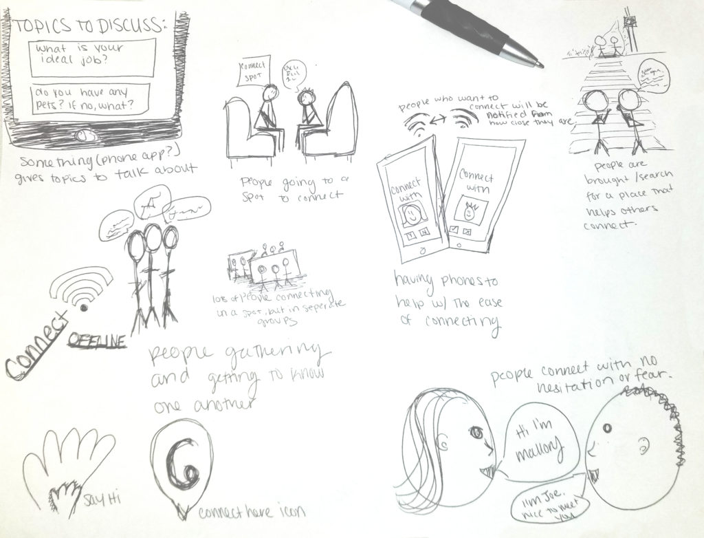
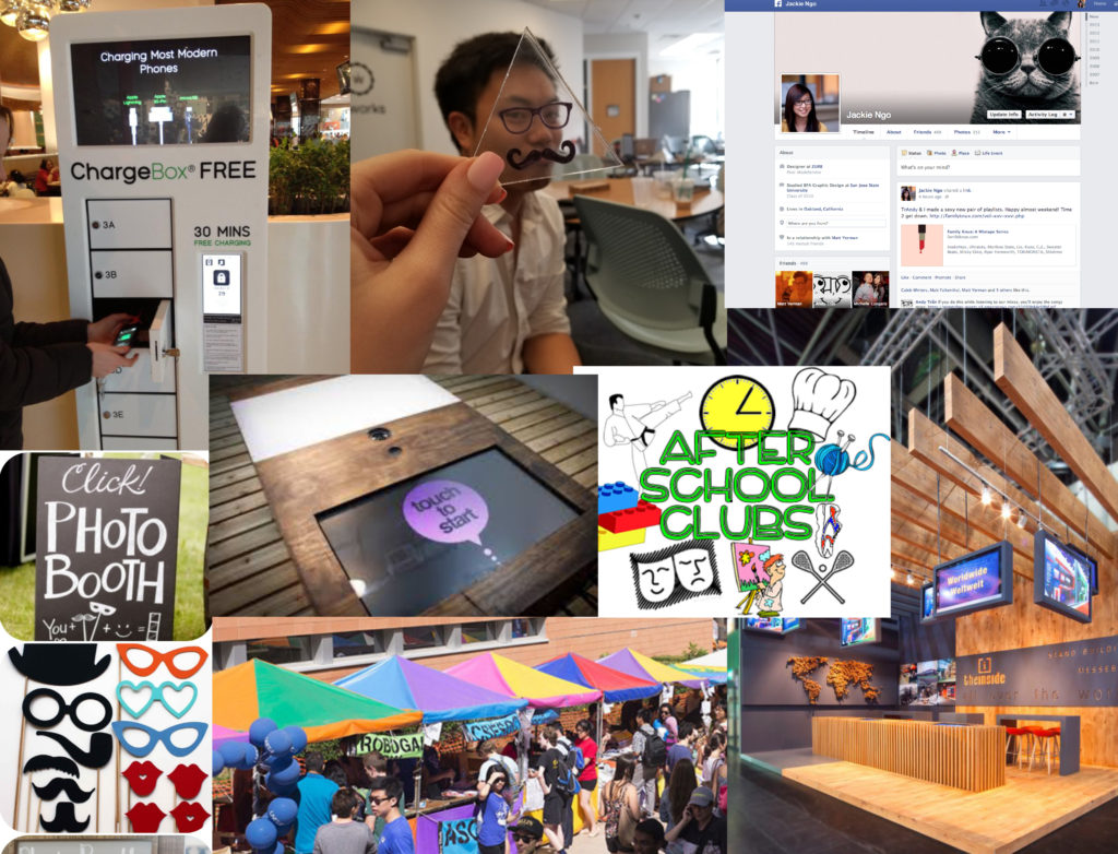
Once I had a clear understanding of what the solution could be, I built mood boards and did visual brainstorming exercises to generate ideas for consideration.
In this phase, I looked for inspiration in current competitive designs, from alternative spaces and from stories I received during interviews. My goal was to push beyond my first ideas and generate a wide variety of solutions to the challenge. Some ideas were interactions with physical objects to using AR and VR. I then tested the designs with a few users that I previously interviewed and narrowed down to a single solution. The concept that users wanted was one that used their phone location and notification settings, and events that provided activity or lesson to help with ice-breakers.


Understanding the User
Using storyboards and personas helped identify key moments in the experience of a student using a smart device to connect.
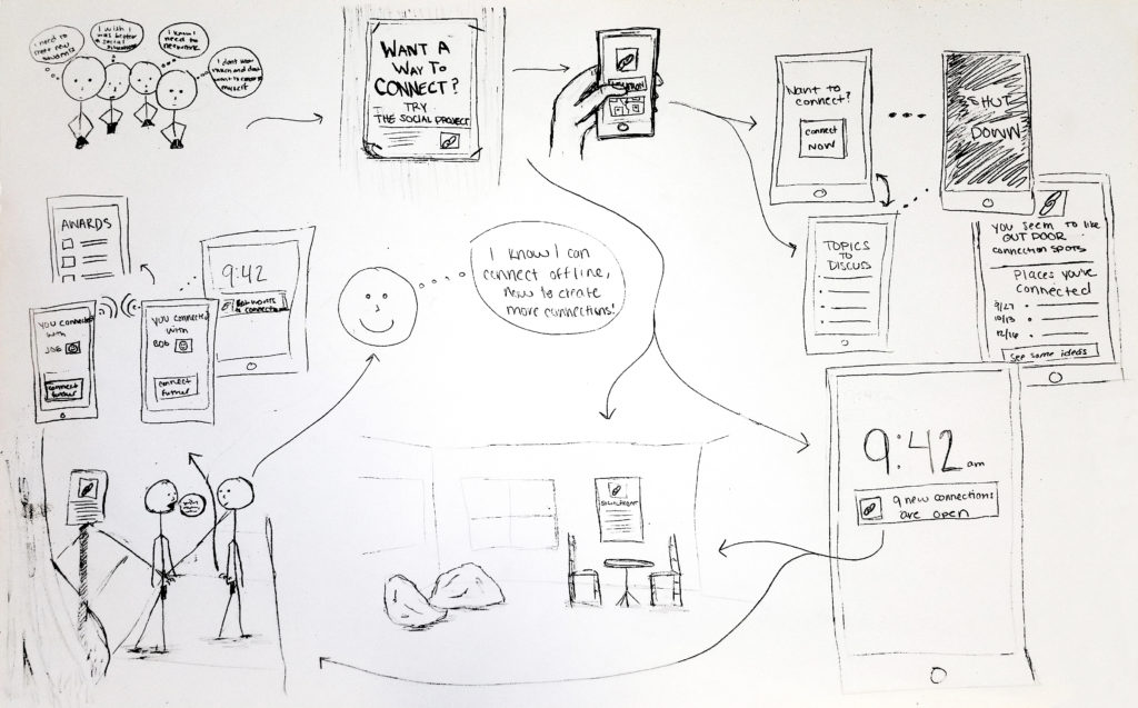
From the results of the ideation phase, I created a mix between a storyboard and user flow to established a vision and revealed issues and key designs needed early in the product development process. The story goes through the actions of a college male. Starting off seeing a poster to start "Connect," then mobile screens to see events, then what he might do at those events.
Based from the storyboard, I identified a primary participant. The proto-persona helped me stay anchored on the users and avoid letting my desire for features trump needs.

These were some developing and prototyping steps took to enhance the experience
Creating a Brand Hero
Using narration tactics, I created a Brand Hero to help envision the product functions and identify specific emotional elements that were needed to help the users. The brand hero, Baxter the White Pup, was based on four archetype categories. Sage, an understander; Explorer, allowing freedom; Everyman, bringing a sense of belonging; Jester, to have enjoyment and no fear.
Creating a mobile prototype and poster mockups
Creating high fidelity mockups established a realistic experience to encourage useful user feedback. I created screens of a user's key interactions with the smart device and designed the posters they might encounter.
I'm a paragraph. Click here to add your own text and edit me. It’s easy.
Mobile Event Notifications
Users would be notified of events when they are close to the location or there is an opening in their calendar.
Knowing about events without a phone
To help draw the attention of passing by students, large and high-contrast signs would be placed around the campus. These could also be used during the event to confirm locations.
Block mode to help connect offline
When at an event, the student would be notified to put their mobile device in 'Block Mode'. Blocking notification and allowing them to focus on the conversations.
Reconnecting after events
Based off the events and block mode time, the app would display the other people you might have connected with during specific events. You would be able to connect via social apps like Facebook or the college online platform.