CONVERTIN
Creating a new way for families to have end-of-life conversations
The Problem
How can we help families have the tough end-of-life conversations with other members of their family without feeling forced?
Legacy Foundry members were ready to talk about end-of-life conversations but didn't know how open the rest of their family was. In America, financial and death discussion are very taboo but our teams previous research findings showed us that over 60% of people (40+) knew they needed to have these conversations with their family members and wanted to have them as well. We saw this problem and wondered if there was a way to create a safe space to start answering these tough questions then be able to connect with other family members who are also ready to talk about the topics.
High-Level Timeline
1 month from research to development handoff
Key Goal
Create a design that focuses on the balance of keeping anonymous data while displaying ways to have those tough conversations.
My Roles
I used UX methodologies like storyboards and user flows to develop the UI mocks and prototypes
The Team
1 UX Researcher
1 UX/UI Designer (myself)
1 Data Analyst
1 Product Owner
1 BE Developer
UX Brainstorming
A storyboard helped us identify moments in the experience of a family member wanting to talk about end-of-life matters but not knowing how to or who to start with.
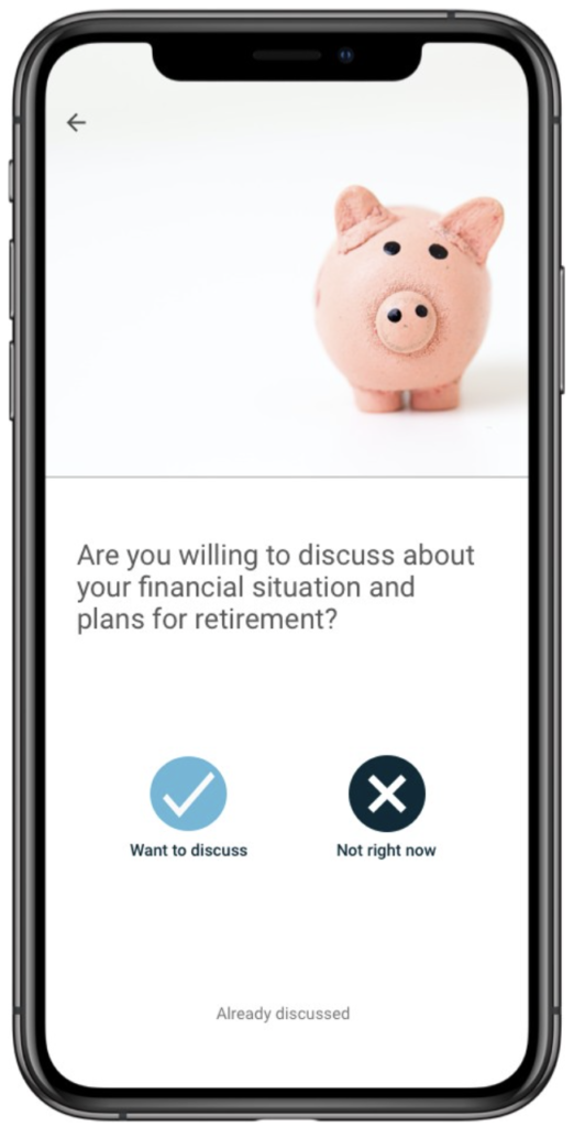
The team got together and brainstormed ways families could interact with each other. We role played and wrote out the scenarios until we came to the best solution of a tinder like app where family members answer questions and then are matched with other family members who are also ready to talk.
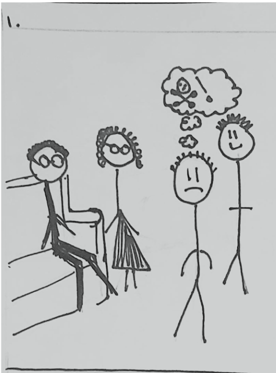
Someone in the family wants to talk about the plans for their mom's and dad's funerals.

That person goes to the app and starts answering questions they want to talk about.
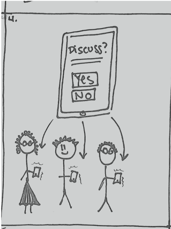
Then a notification is sent to other family members and they answer questions they are willing to talk about.
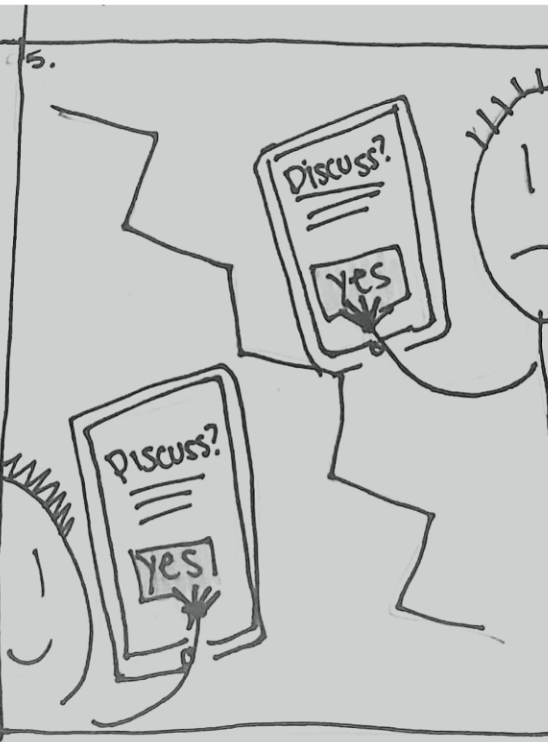
2 family members are both wanting to talk about a specific topic.
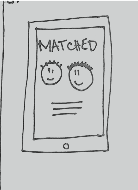
Those 2 people are notified they matched.
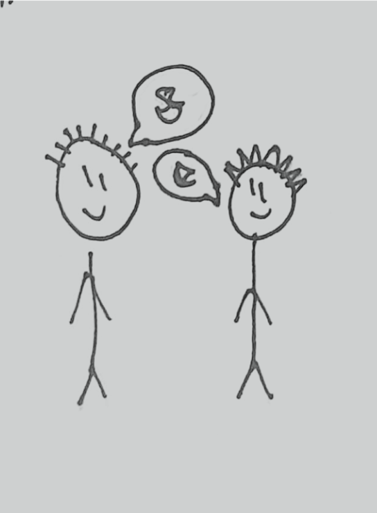
They are then provided with conversation starters and helpful tips to engage meaningful discussion.
Key Issues & Screens
The storyboards established a shared vision and provided more insight to our previous research of potential issues and key screens.
What happens when or if you don't match? How does someone go about talking to some family, but not all?
The storyboard forced a deeper discussion about the benefits and insights we wanted to gather with the product. This helped narrow down the project's scope and focused efforts on key issues before investing time into building the product.
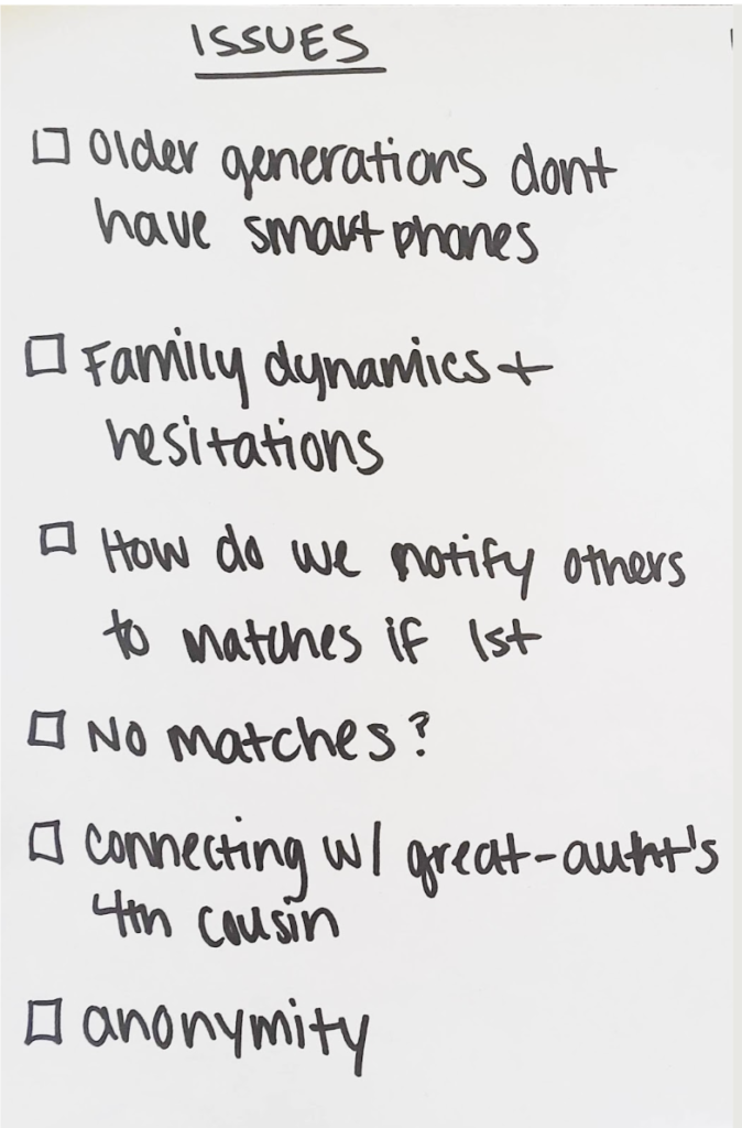
The storyboards let me know what experiences and elements to add that addressed the prioritized issues.
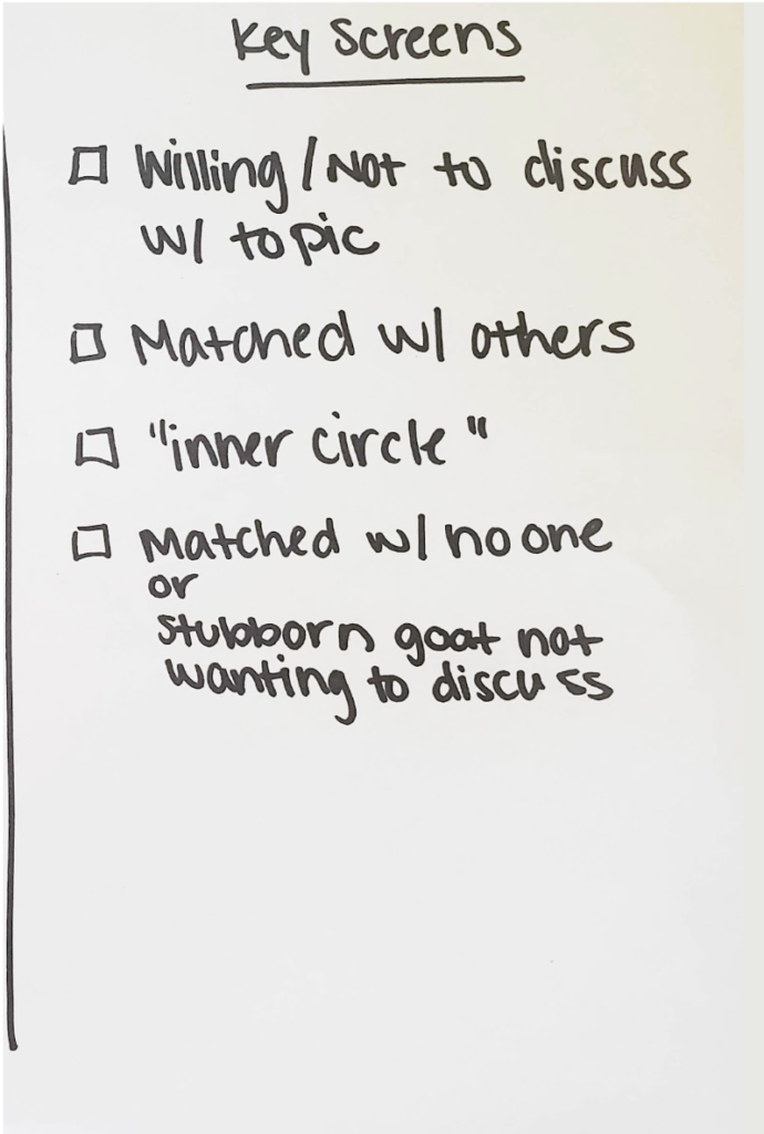
Screens were prioritized by the product owner and developer to provide me what was needed to be designed.
User and Screen Flows
Flowcharts and screen flows for each key screen helped identify key actions within the app and define the UX. This facilitated in a rapid design process of the UI.
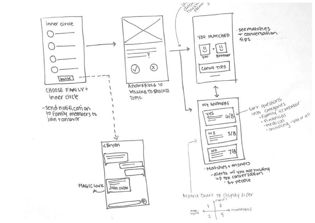
Designing "mobile-first" required us to review our designs and experiences ensuring they were up to Apple HIG guidelines.
The team reviewed Apple's design system guidelines to certify we were creating proper navigation and UI. We prioritized designing for iOS mobile because we were planning to launch to the app store before launching to the Legacy Foundry software.
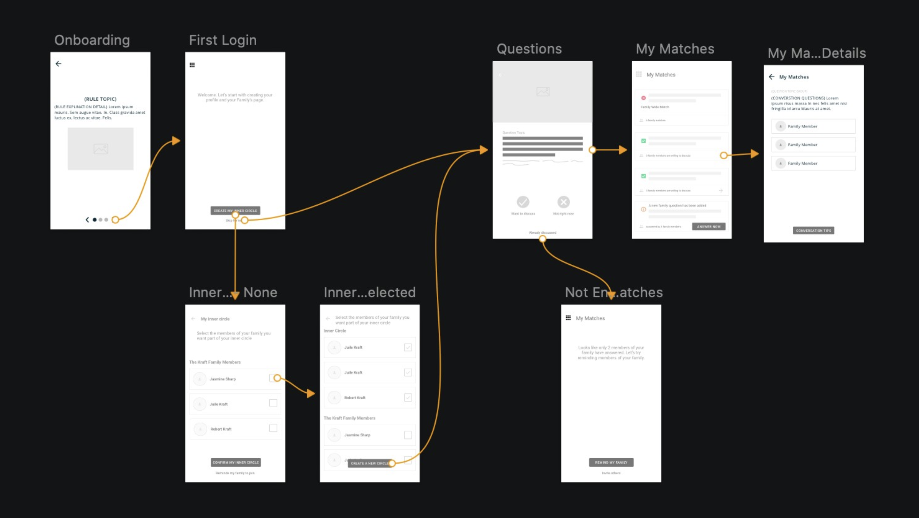
High fidelity screens established a realistic experience to encourage useful user and stakeholder feedback

